Interaction design pattern for brand interaction
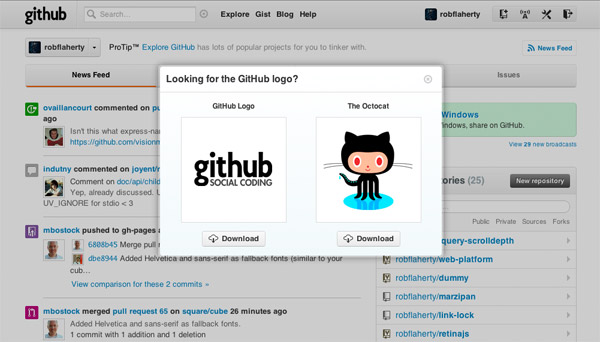
Github does this clever thing where if you right-click on their logo, a modal window opens with options to download Github’s brand assets.

Pretty slick. It anticipates a common action (right-clicking a logo to download it as an image) and it provides the most logical, most direct path possible for accessing the logo itself: clicking the logo itself.
I remembered this the other day when trying to decide how to organize navigational elements for a mobile design I was working on. I wanted to separate the principal navigation actions from the ancillary actions, but I was struggling to find an elegant way to distinguish the two. I noticed that most of the ancillary actions had to do with what I thought of as brand interaction, which is to say a sort of meta activity focused on connecting with the brand as opposed to using the app.
Hmmm. So what’s the most obvious access point for interacting with the brand?
Simple idea for a pattern
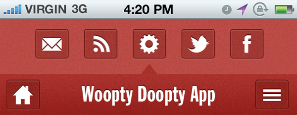
Imagine this is the navigation bar for your app or mobile site:

There are only two navigation options: a home button and a menu button that exposes a drop-down, or slide-out, or modal, etc, some form of navigation menu.
Of course at this point your eyes have raced ahead and you know that I’m lying because there are actually at least three navigation options. The logo can provide access to site actions as well:

The behavior suggested here is that tapping on the logo reveals a tray-like set of options for things like social media connection, RSS, email sign-up or contact, and app/site settings. These are all things that group together fairly well and all things that fit nicely under the “brand” label. (One exception might be the settings button, whose place in the tray is earned more for its meta-ness than brand relation.)
I like that this solution achieves the desired separation of core and auxiliary actions but what I really like is how it gives the auxiliary actions a logical home. Granted it’s not an explicit navigation option (I can hear the sirens of the Usability Police getting nearer as I type). But it’s discoverable and something I think could become quite predictable were this design pattern to become a thing.
Wait, but…
I know, website logos already perform an interaction function. They double as a homepage link. Sometimes, as is the case with this blog, there is no explicit home navigation and the logo IS the home link. It’s convenient for both site authors and users. The user expects it. It’s a best practice.
That’s all true. But I think it’s a heuristic that developed in the absence of a better alternative. Might as well the link the logo back to the homepage if you’re not going to do anything else with it. While I’m not arguing against home-linking logos, I don’t think we should write it off as a reserved behavior.
Deviating from this practice obviously raises the possibility of friction but I see it as low-cost. The user gets immediate feedback and the substituted behavior is innocuous. Also, in a mobile or app environment, where this would seem to have the most potential, the notion of a home-linked logo probably isn’t as relevant as on a desktop site.
If you know of any sites or apps doing this (I’m sure there are more than a few) please leave a note in the comments so the curious of us can have a look.
Both comments and pings are currently closed.
Discussion
Google tried changing the logo to do something other than go home (opening a list of links to other google sites), and ended up changing it back…
@Focks I think it would be a wrong move for google, but a single-purpose app that shores up most used navigation elements would be perfect for this kind of pattern.
@Focks,
Yeah, I think Google is too big and too exposed to take these sorts of risks but as @Divya mentioned it could work well for smaller players.
what if in the showed “menu” we would put also a “home link” , isn’t it a win-win situation?
(if we don’t count the additional click needed…which seems innocuos to me)
Obviously in that example is not needed because a home button is already there.
<3 logical. smart. i concur. great practice at least for mobile, but also could be a great responsive design practice, too, right?
how come i can't facebook like this post?? =\
This was really hard for me to accept because for most of us it is such a standard – obvious – thing, but out in the real world, normal people don’t know about clicking the logo. So any discussion about this really has to begin with a decision about which category the audience falls into.