Photoshop Grid Templates
For the last year or two, much of the discussion about grids in web design has focused on CSS frameworks for building flexible/responsive grids. And for good reason — designers are excited about responsive design and CSS is the overlord of page layout on the web. A large number of great projects have resulted. Too many to list here.
Despite all the CSS fun, a lot of design still happens in the static, pixel-based world of Photoshop. Responsive designs often begin as Photoshop comps. If we want to start with a grid, we need to start with a grid in Photoshop.
When designing for recurrent conditions, it’s nice to have some sort of boilerplate or template that can kickstart the process and save you from repeating yourself. If you’re designing a desktop site, there are a few projects, like the 960 Grid System, that offer helpful grid templates for Photoshop and Illustrator.
But what if you’re designing for mobile? Or for an iPad? For email? For a widescreen monitor? Then you’re on your own. I have searched and I haven’t found any templates for graphic editors concerned with multi-device design. So I made some.
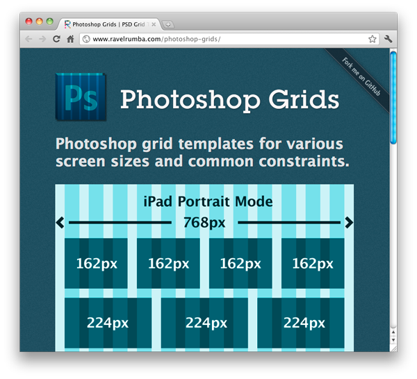
Photoshop Grids is a small collection of grid templates for various devices and common design scenarios. The templates are simply PSD files containing guides and overlays that define a columnar grid. There are templates for mobile, iPad (both orientations), email, and several desktop cases (including widescreen and IAB-300×250-friendly).
To be clear, I’m not suggesting that anyone should produce static designs for each of these experiences. Responsive design is the way to go (when possible). But depending on the project you may want to build your initial design around something other than a standard 960px desktop layout. Mobile first, tablet first, etc.
For more details or to download the templates, check out the Project Page.
If you have feedback or would like to contribute, hop over to GitHub. (Or just leave a comment below.)
Both comments and pings are currently closed.
Discussion
Its good to see someone is out there filling in a different void, designers dig what you doing, cause I know I did when I saw the freebie, so many thanks for taking the time to fill an area that needed replenishing, rather then follow the overflow of what would of been easier..\\MANY THANKS
I am very interested in utilizing responsive design to develop client websites. In order to show “respectability” to convince my clients, I am wondering who in the corporate world has used this design style. Do you know of any “big” players who have pioneered this technology trend? Also, do you have comments on it’s validity?
I see sony.com in this article, that is refreshing. Any others?
@David Rose
Have you looked at The Boston Globe website?
It’s referred as one of first “big players” to move to this design paradigm.
Thanks for the work you put into the templates and making my process (and hopefully others) that more creative then mechanical.
we are learning responsive UI .. its always good to stay upto date in this..
we will make some creativity with this grid